UX Designer and Researcher
4 2-week sprints
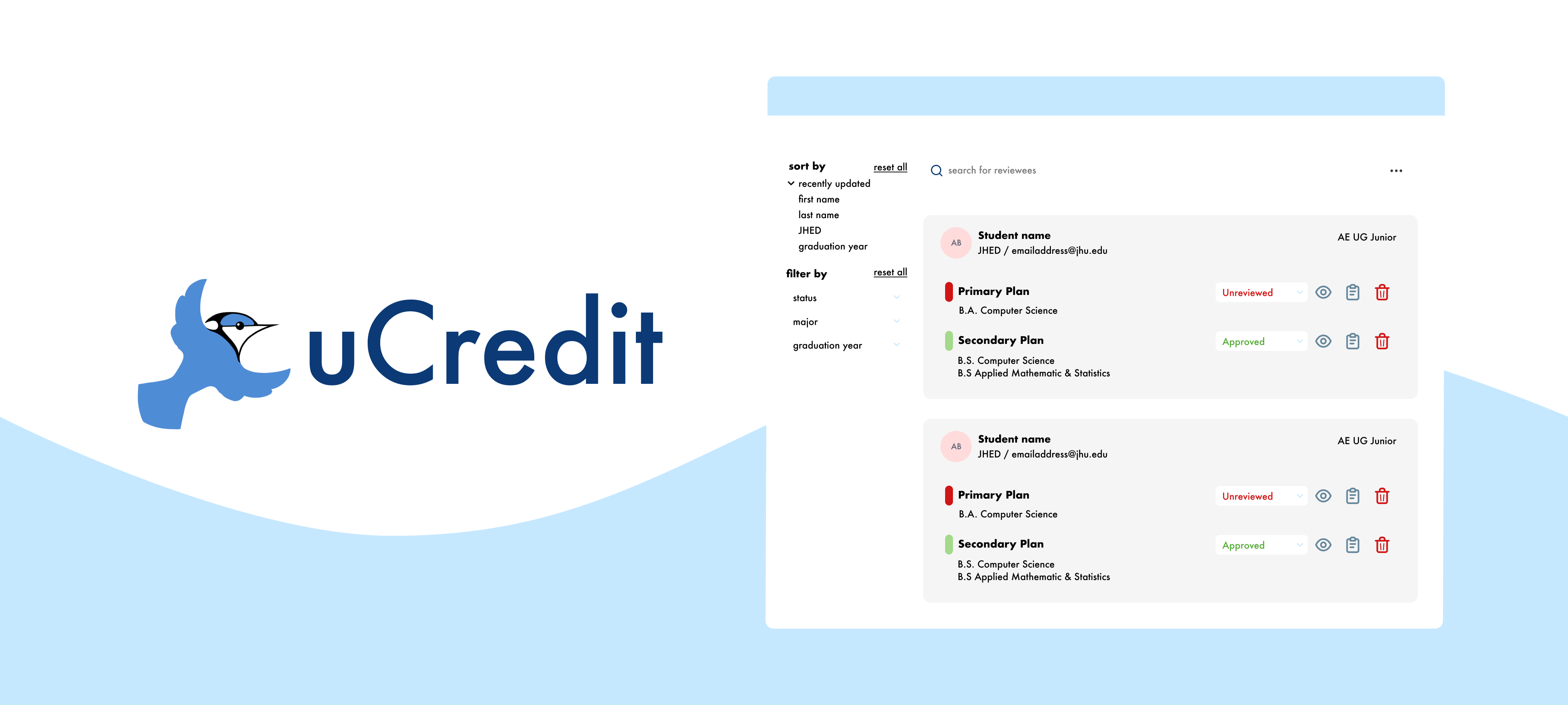
UCredit's main features include a planning dashboard and a reviewer dashboard. From previous heuristic evaluation data, working on improving the reviewer dashboard was an important step for the platform's future.
I worked with one partner on this project. Together, we created a research plan, recruited, conducted, and took notes for user interviews. My personal work included processing the interview research data after affinity diagramming to determine action items, as well as conducting competitive research from various direct competitors.
By learning from the past user feedback in internal secondary research data, we understood some of our target demographics that would potentially use the reviewer dashboard.
We needed to explore two major user groups:
undergraduate students & individuals planning to and/or currently taking college courses for credit
professors, teachers, & those that need to approve a degree roadmap and plan
To do this, we found it beneficial to conduct a competitive analysis to identify spaces that UCredit could expand upon as well as guided usability tests with user interviews to directly see how advisors are currently checking requirements and communicating with advisees.
I created reports on two direct competitors on degree management tools, noting their features after attending two live software demos from the companies.
These findings were useful in determining potential untapped areas for the reviewer dashboard that the team could explore in the future.
We conducted these via Zoom with four students and three advisors. We tailored 8-9 tasks for both groups to discover their process in navigating the current features of the reviewer dashboard.
Qualitative KPIs were gathered from any comments or feedback an interview participant made during the study. What did they do? What did they feel? What did they say?
Post-study, we gathered each participant's consumer effort score (CES), net promoter score (NPS), and scores on a system usability scale (SUS) by asking them to rate some statements on their experience.


From the verbal feedback we received, not all interview participants seemed to be completely satisfied with the existing layout of the dashboard, so we wanted to continue to learn how we might be able to improve the dashboard through our qualitative data.
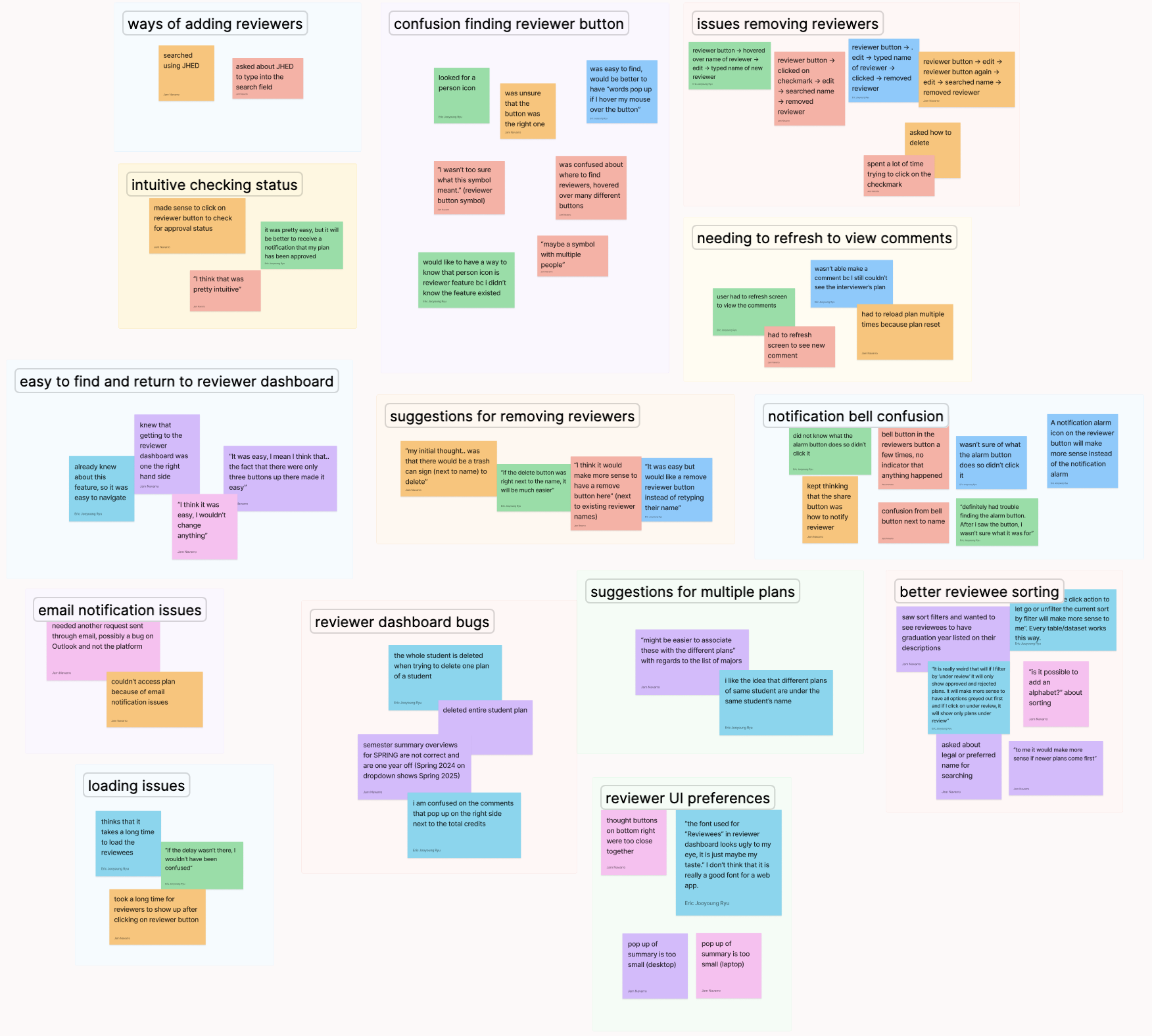
We organized common themes amongst participants, including pain points in navigation, any bugs while accessing information, as well as any points where they had an intuitive experience completing the tasks.
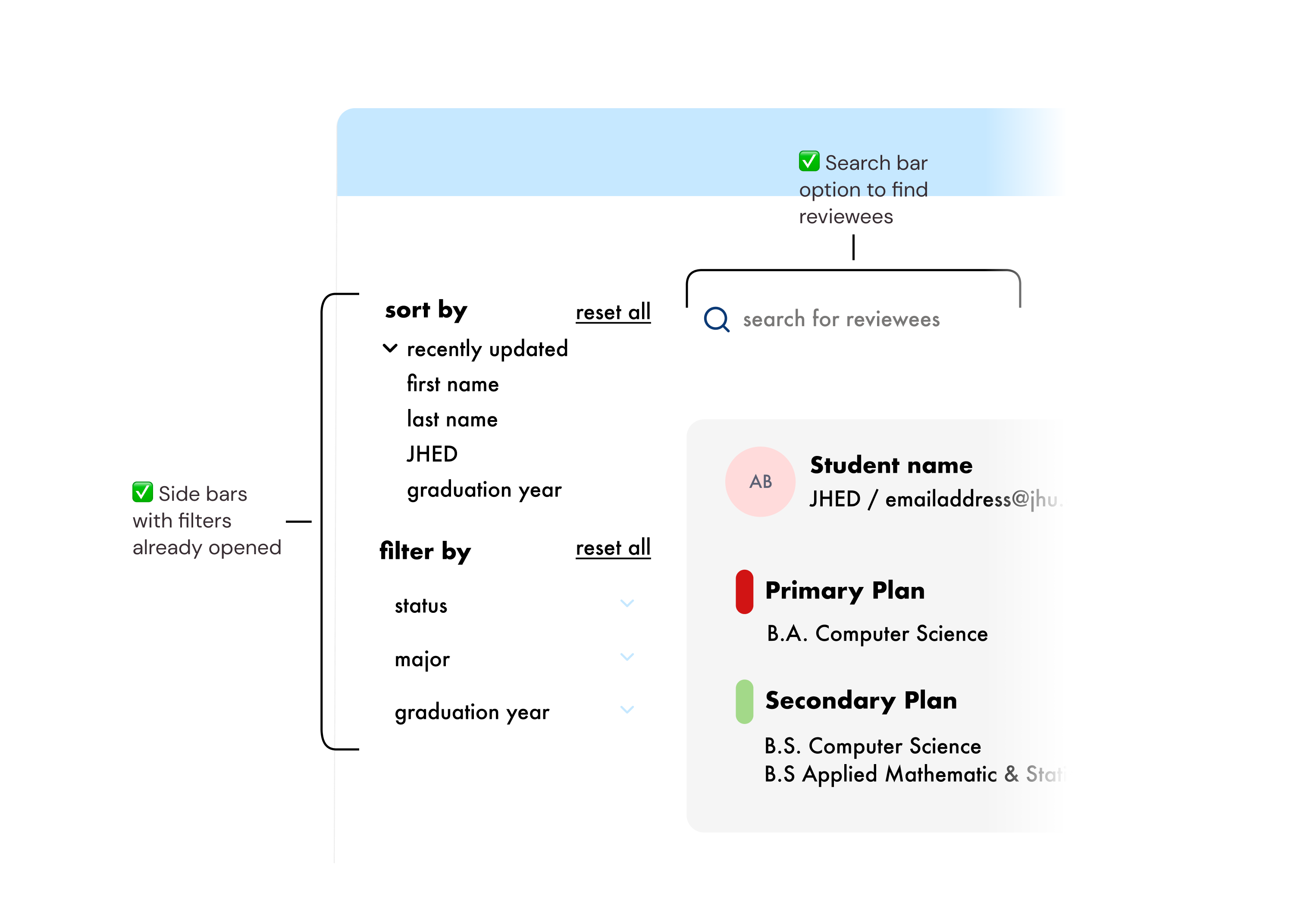
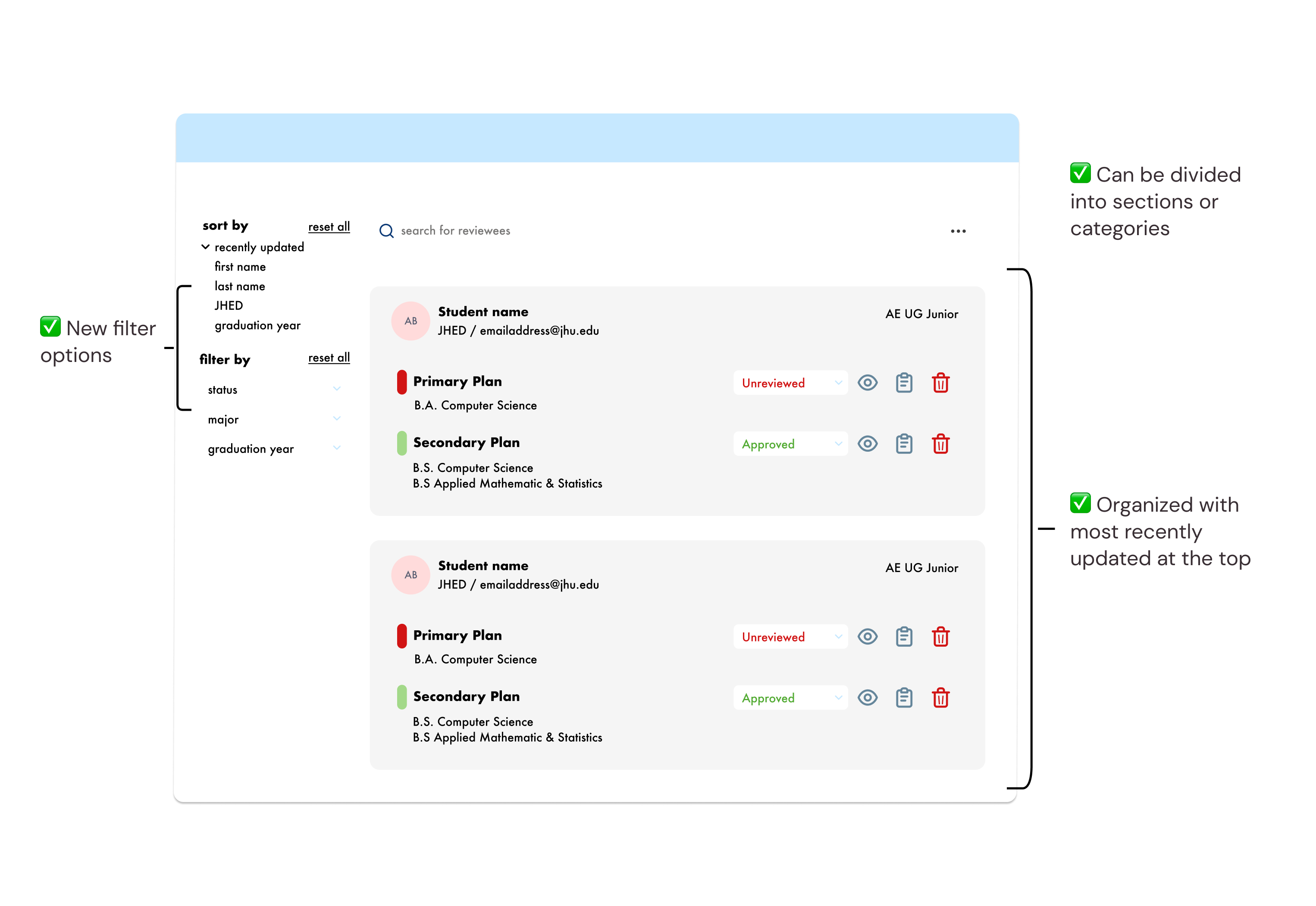
The layout overview of the reviewee list was unintuitive for some users, without filter options to more easily view or customize to find reviewers more easily.
Add search bar to allow free search of reviewees. Add a filter sidebar with all options visible for reviewers to immediately see.
Reviewers were frustrated by the lack of features in organizing their large number of students into groups, sections, or programs.
Include new filter options and allow reviewees to be organized into sections or categories, with default organization as most recently updated.
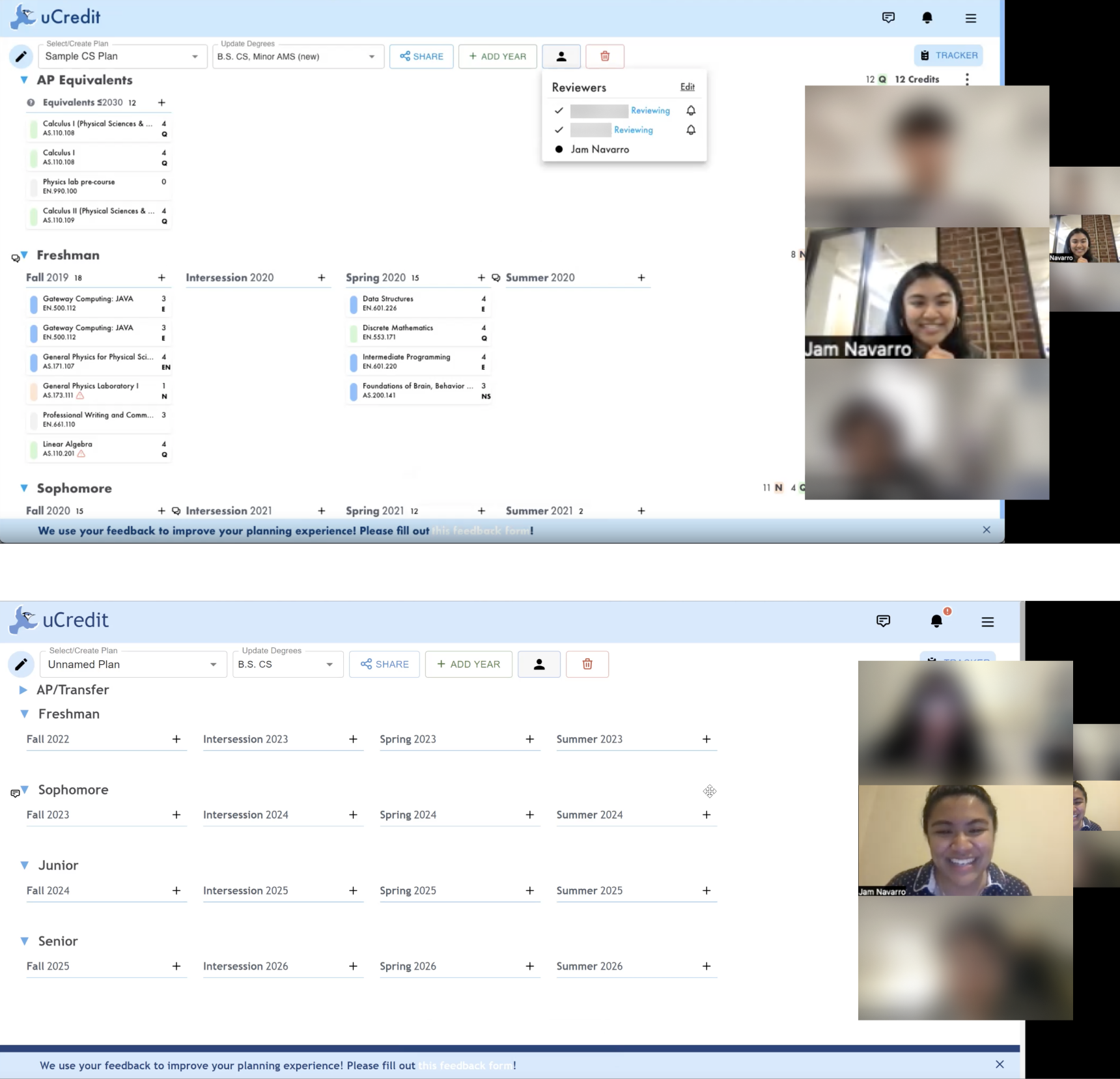
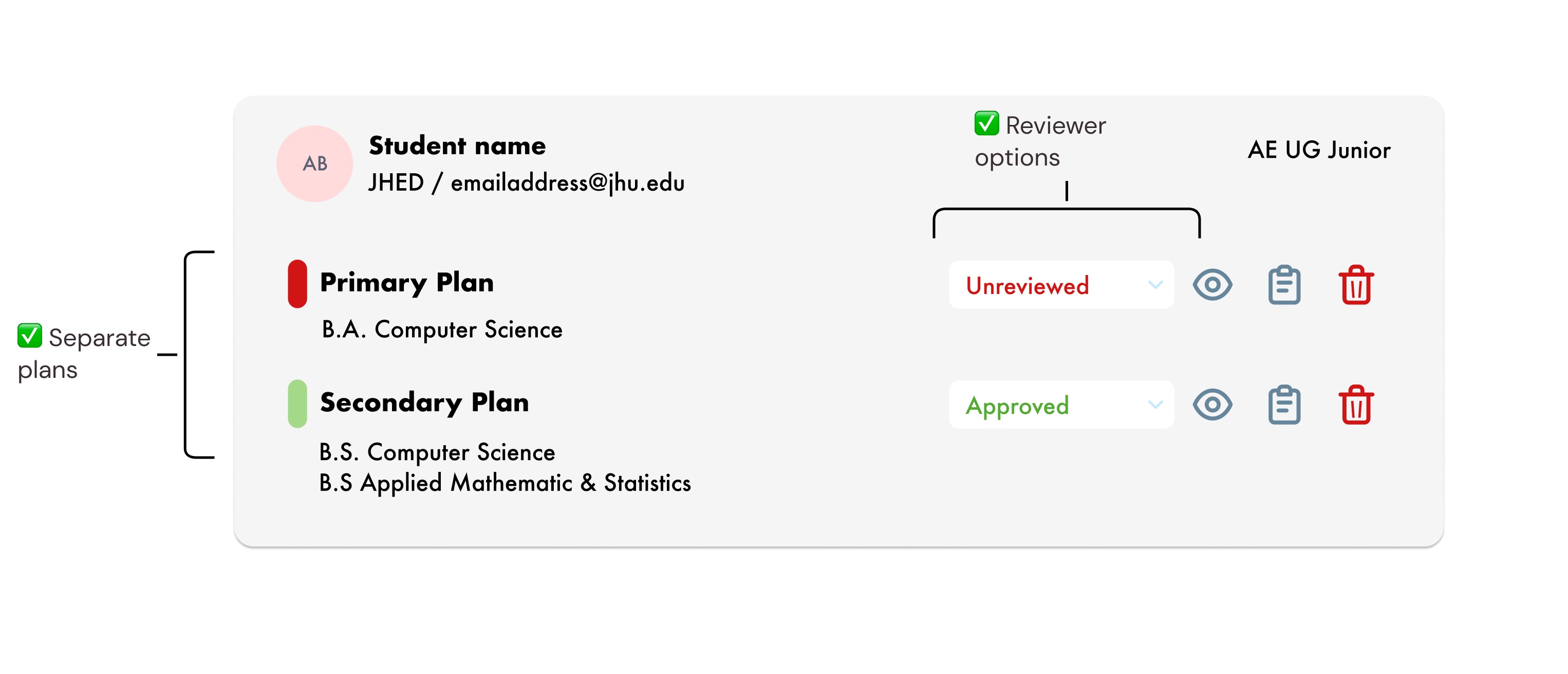
During research, users expressed issues regarding having separate plans from the same user. Users were also consistently unable to accurately identify when changes or reviews have been made regarding their plans.
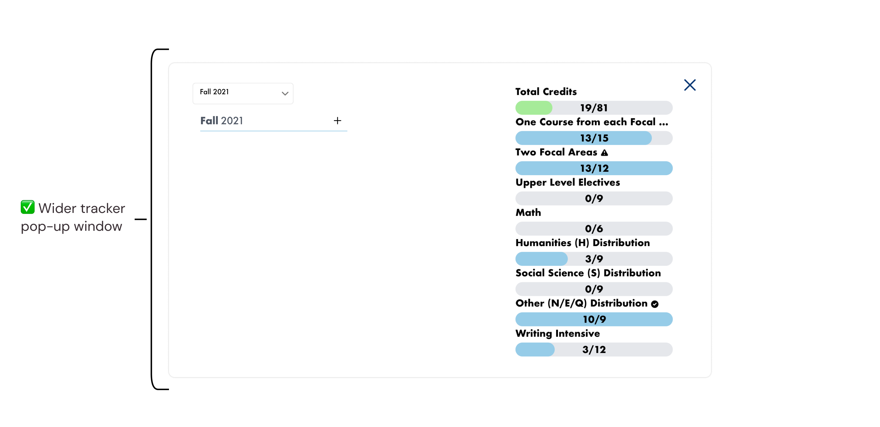
For some, viewing user summary information on the screen was difficult due to size.
Implement separate plans for each student, and allow reviewer options to help students understand changes or feedback on plans. Include wider tracker pop-up window for ease of viewing.
I understand now from personal experience that interviews are a long and complex endeavor. It's good to be able to explain to yourself and your stakeholders why it's worth spending time and effort on.
The recruitment and interview process took over two 2-week sprints, which was longer than we had initially anticipated. For future considerations, I know now to always request to interview more people than you expect.
During this project, my team encouraged me to make sure I back up any solutions I thought of with research. This is a great skill for me to continue building and learn to move away from making isolated design choices that might not be great for the users I'm designing for.
Especially for a startup, it's crucial to know what the team should be able to improve next and make this kind of research really count in the same way our secondary research really helped our process. My own possible next steps for my role on the UCredit UX team included in-depth reviewer dashboard wireframing and prototyping, as well as focusing on the interaction between students and trying to increase the collaboration and community of peers on the platform.